
November 13, 2008
Outlier Tailored Performance

Outlier is my new venture. Probably find me writing a bit more there then here for a while. Outlier makes tailored performance clothing for cycling in the city. SItes filled with info so take a look. Smart shoppers probably want to head here or here to catch a discount...

January 25, 2008
October 24, 2007
Photoshop by Committee
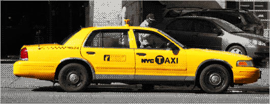
It's easy to just say design by committee. The story behind the new New York City Taxi graphics reads like a text book case. A firm makes a design. The client gives feedback. A new look comes in. Another firm comes late in the game with a new design element. A powerful department rejects a design for intruding on it's turf. The result is a sloppy hodgepodge of elements. Designers are rather predictably lining up to critique it.
Personally I rather like it. NYC Taxis have always had a sloppy mix of design elements on their side. Anything cleaner and neater, anything better designed, would threaten the only design element that matters. The bright yellow color screams "New York Taxi" louder than anything millions of design and innovation consulting fees could ever generate. As long as the cabs stay yellow, those taxis will look the same. What will never look the same again is NYC.
The new taxis provided a bit of political cover for an even bigger design project. New York City has a new logo. The suddenly infamous Wolff Olins designed it. and the new NYC taxis are the first place most New Yorkers have been exposed to it. Those taxis are design by committee, but that logo is something different. You can call it Photoshop by committee. Get used to it cause you'll be seeing a whole lot more of it.
What happens when you have a committee where every single member has a copy of Photoshop on their computer? Or worse yet every member has a designer on staff? Design by committee once broke down to a bunch of opinions and needs, all sorted out by one or two designers. The committee stacked up its requirements, its problems and its bullshit, and the designer cooked it all up into some bland result. A designer in that situation today would feel blessed.
What happens in Photoshop by committee is far worse. The needs and the problems and the bullshit are still there of course. But then comes the designs. Not just from the designer, but from the committee members. From their staff designers. From their assistants. From their teenagers and toddlers. From their neighbors, coffee shop baristas and dogs. Committees were once additive, the members just piled on the guidelines and suggestions and the designer boiled them down into a result. Now committees are recombinant. They warp, splinter and evolve into competing designs. The designer is barely the designer at all. They are the person who must make these mutations all work together.
Design by committee is about making rules. Photoshop by committee is about breaking rules. It's often the only way the designer can get the multiplying designs to recombine. Wolff Olins' professional salespeople call this "container logos" and it seems to be winning them some super premium clients. Most of us would just call it bullshit, but we aren't the ones with the super premium clients.
In the case of New York City what this amounts to is a big old smudge of the letters NYC. Not surprisingly it looks a lot like design from the early days of Photoshop. A design from an era where designers had no idea how to use the powertools in their hands. It's ugly and clunky and has nothing to do with NYC beyond using the letters. I love it. It follows none of the rules of design that stifle the profession. It's loud and bold and will show up in all sorts of places. Like the full NYC taxi design it graces, it will never step out of the shadows of a far bolder design, Milton Glaser's classic I (heart) NY logo. Is it great graphic design? Not at all. But it is great Photoshop by committee and it will work just fine.
August 08, 2007
Anticongestion Antipricing
Every once in a while a political issue rises up to put your various political beliefs to the test. As a cyclist and bicycle commuter in New York City I'm a huge advocate of Mayor Bloomberg's congestion pricing plan. As a pragmatist I like it even more, the track record of congestion pricing in London is stellar, this isn't just an idea du jour, its one that's proven to be both implementable and effective. Bloomberg sometimes moves with a speed that's shocking unpolitical, and he whipped the idea of congestion pricing in NY from a political dead letter to the hot issue of the day in months, and it was easy to get swept up in the enthusiasm. But then it ran straight into some classic legislative congestion in the form of the New York State legislature and all of a sudden no on has any clue where this plan is going. It's in that pause that I remembered one thing and realized another. One congestion pricing is some scary surveillance society shit, and two that there probably is a much better way.
While I'm on my bike I'm pretty much in favor of any idea that gets cars out of the way and away from me. Everyone has there own little biases, and I've come to realize I don't believe anyone behind the wheel of a car has any rights at all. They might be my favorite person in the world, but when they are driving (and I'm not in the car!) well they are just another one of those subhuman driver things... But congestion pricing is something of trojan horse for left, a concept that legitimizes extensive implementation of computer guided video surveillance, a vehicle to make our world feel a whole lot more 1984. Big Bloomberg is watching you, and making sure the streets stay nice and clear for those nice cyclists...
I've got a better idea, instead of building a massive infrastructure to watch the roads and bill the drivers a measly $8 a day, why not make driving in New York City (or at least Manhattan or in the legislative terms the CBD) truly expensive and clear the streets right out. Why not ban public parking? Just cut it out completely. Any vehical left unattended on a Manhattan CBD street gets towed. Real simple.
That's an extra two lanes on just about every street. You could make the left one a bike lane on every street for bonus points, but really I wouldn't even care. Wider streets with less cars would make NYC a cycling paradise with or without bikelanes. And at the rates garages charge in NY that will cut the amount of drivers radically, they'll be paying a whole lot more than $8 a day to drive around downtown that's for sure. Libertarians of all people have been getting hyped to a variation on this idea, but as per there style it's much more money obsessed. There version is that on street parking should be more expensive, that it should be charged at the market rate, in the libertarian eyes on street parking is a subsidized government privilege and they want the subsidy gone. I'll go further though. It's not the cheapness that's a privilege, it's the very existence of parking on the street. Maybe it made sense once, back in the day when cars were rare and stables more common than garages, but in this day and age the question we really need to ask is can cities afford to give that much public space over to parking private vehicles?
July 05, 2007
Notes on the iPhone

- I wasn't planning on buying this thing, really. But after a trio of raves from some of my favorite interface commentators, I quickly realized I pretty much had no choice. There is no question the game has changed with this device.
- There was a period of time where the iPhone sat in the cradle, iTunes with the AT&T sign up screen loaded and the Treo on speakerphone hold with Sprint. For a half hour or so I sat there essentially debating which corporate force I should commit my soul (or at least my personal data) too.
- Of those three corporate monstrosities Apple is by far the scariest to me as it functions as a dictatorship. Whatever control Sprint or AT&T have over me is at least modulated by their natural bureaucratic inefficiencies.
- The fact that Apple went with what is apparently the weakest/worst cellular company shouldn't be surprising as they are also naturally the company most likely to give in to Apple's demands.
- The fact that I am once again an AT&T customer has not really set in yet. Once it does I'm sure it will be depressing.
- Palm/Treo is just too sad of an entity to be counted as either a corporate monstrosity or a threat. If they had expanded upon the Treo 300 in any sort of semi reasonable rate of progress over the past 4 years they'd have a device at least as exciting and useful as the iPhone. Who knows what the story is over there, but it's got to be too pitiful for me to want to hear it.
- There are about 18 million things that my Treo 700p does better than the iPhone, yet I have no intentions of ever going back. The Treo is just too damn heavy compared to the iPhone. Not in weight really, but in thickness, in processor slowness, in interface sludge and a stubborn resistance to evolution.
- The iPhone is really a computer. It's explosive success in part comes from being the first mobile device designed as such and actually succeeding. Most phones are designed like overgrown pocket calculators. The Palm and Treo owe there success to working well with the limitations of late 90's chips and making a great intermediate device. The iPhone is the real thing.
- The iPhone fits in my pocket so well it convinced me to eliminate half the items in my pockets.
- The iPhone is too symmetrical, there are no great tactile clues on how to orient the phone when you take it out of your pocket. It is just as intuitive to hold it upside down as it is right side up.
- The multitouch interface is incredibly intuitive, you feel like an expert user from practically the first touch.
- An incredible effort has gone into making this thing feel smooth and seamless.
- All the organic sliding looks and feels great and also owes an incredible debt to the much maligned interface designs of Flash websites.
- The iPhone interface designers could learn a fuck load from the early Palm's insistence on eliminating as many unnecessary clicks as possible. There is a subtle tendency to hide poorly thought out interface ideas under animation effects. It's not to bad yet but I can easily see it becoming an issue in the future.
- There is some serious inconsistency in the interfaces. Notes gets a big WTF for one, did someone's grandkid code that one? Weather gets a whole icon on the home and then leads to an essentially flat app, no detail. The little one that annoys me is the edit button on the sms & email apps, it's in a different place on what are otherwise nearly identical interfaces. The lack of search in contacts is mystifying as there are contact search functions in other parts of the phone, it's a bit odd.
- What retard decided there was no need for any sort of multi-selection? Deleting email one at a time is a serious chore and copy and paste just doesn't exist. This better be a temporary glitch not some one button mouse obsessive disaster.
- As much as it pains me to say it, the flexibility of the multitouch interface seems to trump the tactile feedback of hard buttons. If anything there might actually be one hard button too many on the iPhone.
- Tactile buttons aren't going anywhere though, they just need to be built for specific uses and separated from the general device. The iPod aspect of the "phone" is in parts exceptional, but doing something as simple as skipping to the next song can be a laborious chore.
- Adding physical buttons back onto the iPhone is pretty much the kiss of death, the computer in your pocket effect only works as long this device stays as slim and seamless enough to be able to forget you are carrying it.
(update - I quickly realized I'm wrong on this, a standard phone like five way button where the home button is now would be great. A button or two on the left & right of that would really help too.)
- Externalizing the physical buttons into an external device (an iPod remote for instance) seems like the best solution, but it's still a compromise, the proliferation of devices does not end with the iPhone. It may be the most convergent of all mobile devices yet, but convergence is starting to look like a phenomena that occurs in tandem with, rather than in opposition to the seemingly exponential growth of devices.
- Is anyone working on a tactile touch screen? A screen capable of producing some sort on non audio-visual feedback? The future is begging for it.
- The iPhone needs 3G badly, the difference between using it on WiFi and on AT&Ts network is radical.
- The lack of 3G sucks for us early adaptors, but it might be great for WiFi. I'm almost certainly reopening my personal connection up to the public, after knee jerk adding a password to it. I wonder if Apple will start shipping Airport stations that default to open?
- Using the iPhone gives you a totally different understanding of WiFi, a real understanding of what a WiFi mesh might be, as opposed to an isolated set of access points that you laptop into the internet from.
- If this phone shipped with 3G wireless data, WiFi would be pretty much a mute point.
- The difference between using a WiFi mesh network and 3G network provided by a cellular company is intensely political. Yet the only difference the end user might will generally notice will probably be in their cell phone bill. And it's unclear whether that difference will be an increase or decrease.
- Playing with the iPhone really does feel like you are playing with the future. Yet function wise the only real difference is in the interface. Other than perhaps the very nice visual voicemail, there are no applications on the iPhone that aren't already bundled together in most of the smart phones that have been on the market for a while already. Is this device just a slick slight of media trick, or has Apple (and/or Steve Jobs) really singlehandedly pushed us into the next generation?
February 19, 2007
Symbolic Action (In Defense of the New Radiation "Symbol")

Well next time you see that sign a coming you better run. It's a new supplemental symbol for radiation danger, commissioned by the International Atomic Energy Agency (IAEA) and the International Organization for Standardization (ISO) and designed to convey danger in a more intuitive way then the traditional radiation "trefoil". Now the interaction designers over at Adaptive Path are absolutely turding all over the results (and Michael Beriut just sighs), and in many ways they are right, it clearly is the result of design by committee and there is nothing elegant nor simple about symbol they generated.
Then again, there is nothing simple nor elegant about dying from radiation poisoning is there? And to ask the IAEA and ISO to do anything but design by committee is akin to something in between asking for a complete redesign of international relations and the impossible. To accuse them of design by committee is a completely valid statement of fact, but it's also a rather impotent critique. To ask them not to design by committee may be fantasy, but we can very reasonably ask and expect them to design by committee the right way (or at least in one of the right ways) and with the new radiation symbol that appears to be be exactly what we got.
Now I have a lot of respect for Adaptive Path and I'm sure with the appropriate time and resources they could produce a symbol at least as good and most likely better than what has been created. In that process one of the first things they'd probably learn is something that is clearly not evident their current critique, that it is radically more difficult to create symbols that invoke action then it is to create symbols that describe objects.* At least at this juncture in time signage symbols are inherently static, solid and rigid. To transform a static, solid or rigid object into a symbol, is a relatively straight forward act of abstracting the objects characteristics into lines shapes and colors. Some objects are easier to work with than others, but all at least possess tangible starting points to abstract from. Verbs however are by there very nature intangible, and more difficult to capture in abstraction. When the goal is not just to encapsulate the verb, but actually trigger it, to create sign that does not just represent but actually creates an action then the challenge is exponentially harder, and that is exactly the challenge the IAEA and ISO were faced with, creating a sign that does not just warn people, but actually causes them to turn and run for their fucking lives. Not exactly the easiest task.
There is one sign that is radically more effective at creating action than any other, and that is the stop sign. Part of it's effectiveness is it's ubiquity, it many cultures you can find the stop sign just about everywhere, so it's easy for the meaning to get ingrained. The red color helps as well, but ultimately the stop sign is successful because all symbols are stop signs. Often it's more of a mental stop then the physical stop, but one can not process a symbol unless one pauses for microsecond and then reads it. When one reads the stop sign one has already begone the process of stopping, all the sign does is say continue on through with the stopping process. No matter how fast one might be traveling as soon as one actually sees the stop sign there is at least a little bit of inertia going into the act of stopping.
What this means in terms of making signs like the radiation symbol designed to induce action, is that task is even more difficult. Conveying an action in static is hard enough, and getting people to follow through and actually do the action it is exponentially harder, but on top of that the very fact that the message is embedded a symbol is invoking the exact opposite effect, causing the reader to pause and stop for at least a second before hopefully doing a 180° turn and running away. And it's this challenge that the committees of the IAEA and ISO were faced with as they went about designing their new symbol.
The result is indeed neither very elegant nor simple, but it is in fact I think rather effective and quite interesting.** Rather then produce a symbol as they claimed to have done, they actually produced something rather different, a small comic, five symbols sequenced to invoke an action. It's actually a rather innovative solution, something which contrary to the Adaptive Path post, you actually would not really expect to emerge from a committee in action. For if the goal is to create an action, a static symbol is not the right way to do it. But by creating a microcomic, a sequence of symbols, what emerges is not just a static sign, but a sign filled with action, filled with invisible gaps between the actual symbols, gaps that the mind fills in with actions. Gaps that turn the static noun of a flat still piece of signage into an active verb, a true call to action. It might not be the best looking sign but it pretty clearly warns far better than then old abstraction of the "trefoil." So there you have it, read the signage on the wall and get the fuck out of here ; )

- This lack of distinction is clearly apparent in the hypothetical symbol for taxi that is used as a rhetorical device in the Adaptive Path blog post. A taxi is of course an object, a noun, while running from radiation is an action, a verb, yet in the post they imagine that the taxi symbol would be created in a similar manner as the run from radiation symbol.
** It is however certainly not perfect, I'm a bit concerned with how people accustomed to reading right to left would interpret the bottom, it could well mean "if you run you die". However the symbol was apparently tested in China, Saudi Arabia and Morocco, so at least due diligence seems to have been done in that regard.
November 11, 2006
Irreversibly Google
The story of Google is in many ways the archetypal engineer's dream. They invented a better way search the web, set up in a garage-like space and rose to the top. But engineer's also value results that can be reproduced, and part of what makes Google so scary is that it can not be reproduced. As hard as Yahoo and Microsoft are trying, with obscene amounts of financial, engineering and computing resources at their disposal they can't generate search results as good as Google's. The search world is already oligarchical, but as google rapidly turns into a verb, it is well on it's way to become a monopolized space.
Page Rank you see is an irreversible and an irreproducible process. Page Rank is the name for the key aspect of Google's search algorithm, the engineering breakthrough that make Google so much better than all those now dead or battered search engines of the 1990's. And it's also the thing that makes it so damn hard, if not impossible to make a search engine as good as Google's. You can reverse engineer Page Rank of course and you can be damn sure both Yahoo and Microsoft have invested plenty of time to that effort. The problem though is that Page Rank just would not work if you ran it today, and that's why Yahoo and Microsoft just can't provide the same quality of results as Google.
At it's core it's a problem of the data set. Page Rank's big break through was that it realized that links between webpages could be used as a way to judge the quality of a piece of content. If a page was linked to by multiple sites odds are it was a better page than one with no incoming links. Furthermore if the links came from other high quality pages the odds would be even higher. I wrote that all in the past tense though, because Page Rank is a victim of it's own success. The internet is now filled with massive amounts of pages generated with the explicit goal of hacking Google, of pushing sites up higher in it's search results. The internet as a dataset is now dirty, if not filthy.
This is a problem for Google of course, but it's not nearly the same problem it is for them as it is for it's competitors. Google needs to deal with the many sites trying to hack it's results, but it has a major tool to fight them, the data generated by Page Rank before search engine optimization became a profitable and fulfilling career. It means Google weighs slightly towards older sites, ones established in the era of clean Page Rank, but it also means that anyone trying to reproduce Page Rank by spidering the internet today, just can not get results nearly as good as Google's. So until someone devises a brand new algorithm, it's going to be Google's internet and the rest of us are just searching for our own small little piece of it...
November 01, 2006
Pro-markets, Anti-profits
Pro-Markets, Anti-Profits
It's a statement so dangerously wrought with oversimplification that I've been avoiding saying it for a while now. But simplification can sometimes be as, or more, useful than oversimplification is dangerous, and nothing sums up my political economic stance better than reducing it to two positions: pro-markets, and anti-profits.
First and foremost this stance requires a split from a great mistake made by most traditional appwroaches to economics from critical marxism to laissez faire boosterism. Market activity and profits are not the same thing, but in fact too very separate forces and while they can and often do work in concert with each other, they do not always do so and certainly do not need to. If the goal of economics is to gain an understanding of how economies operate in order to improve them, and I believe that that has to be a major goal of economics, than coming to grips with this split is absolutely essential.
My stance may simplify down to "pro-markets", but it is essential that this stance not be confused with the far more common "pro-market" approach. The difference might on the screen or page be a matter of one letter, the addition or absence of an "s", but like many differences between the singular and plural this is actually a difference of nearly infinite ramifications. There are many (upon many) markets in this world, but "The Market" in the sense it is often used does not exist at all. Of course "the market" can exist in a very local sense, the way a mom might tell a kid to "go to the market and pick up a quart of milk." But "The Market" in the abstract sense that both proponents of "The 'Free' Market" and their many critics like to use it just does not exist at all. There are many markets in this world and the behavior of these markets in fact varies wildly. The baazar in Marakesh just does not function the same way the London Stock Exchange functions or the the way my local coffee shop functions. Heck, even the New York Stock Exchange functions differently than the NASDAQ market, and in fact there are even multiple markets for New York Stock Exchange stocks, each of which behaves slightly differently. The market for art at Sotheby's auction house is different than the market for art in a Chelsea gallery, which is different than the market in an Amsterdam gallery which in turn functions radically different than the nearby Dutch flower auctions.
A market is at it's core simply a place of exchange, a bounded area where people converge, either physically or via a mediating technology, in order to move exchange goods, services and information. To be pro-markets is to be in favor of the existence of markets, and to understand that each and every one of them behaves differently. Sometimes this behavior can have quite positive results, sometimes they can be rather negative and generally what reality gives us is a complex and nuanced mix of the two. Overall though markets are places of exchange and exchange itself is a healthy operation. By realizing that some markets behavior better than others we can begin the process of designing better markets, emphasizing those that work well and improving those that need work.
In order to evolve and create better markets, we need to make at least one key conceptual leap, me must break the historic tie between market functions and profit. Markets do not need profits in order to function at all. In fact it's possible to interpret profits in such a way that they are actually indications of an improperly functioning market, where the existence of profits indicates an inefficiency in market actions, a flaw that a more perfect market would correct. It's not an approach I'm about to follow, because perfect markets do not exist in the real world, and what I'm interested in is working markets, and the task of making them actually better.
Profit is perhaps one of the more unclear and misunderstood words in the english language. So much so that a large portion of the entire profession of accounting is dedicated to the art of obfuscating profits, pushing and shifting them around in ways that tend to be highly unprofitable to the public at large but rather rewarding to a select group of individuals. And just as profits can miraculously transform in the hands of a skilled CPA, the very meaning of the word has evolved in a rather confusing mash of economic theory and government action.
In classical economic theory, profit was deeply associated with the figure of the entrepreneur. Profit was how these idealized people would make their way in the world, they would purchase goods, transform or move them and then resell in a market. The difference between their expenses and the selling point, provided it was positive, was profit and this profit functioned as the entrepreneur's reward, salary and means to continue their business. It's quite a positive viewpoint of profit, and unfortunately it has little to do with the reality of how business is conducted and profits actually calculated today.
The entrepreneur as mythologized by classical economics barely exists anymore. Even those bold individuals who embrace the title today tend to wrap their enterprises in the protective skin of some form of limited liability corporation rather than proceed as sole proprietors or in traditional partnerships. Profits that pass through these organizations take on a radically different form than they do in the naive view of an entrepreneur. In fact even in a sole proprietorship or partnership profit transforms the minute that salary is introduced to the equation. For salary is after all an expense and profit is from a legal standpoint what occurs after all the expenses are paid. As soon as an entrepreneur is getting a salary, suddenly profit is no longer their just compensation for effort and risk, but in fact what is left over after they have been compensated for their time and work. Some of this profit is reinvested back into the enterprise of course, but all to often it is extracted from the system and into the hands of a limited set of individuals.
Classical economics is essentially about "individual profit", yet in this day and age while there are plenty of individuals making profits, it is almost always "organization profit" that they are making. Organization profit is not the organization's reward for good work, but in fact it's punishment, this is money that is extracted from the organization and back into private hands. It is still entirely possible to incorporate and run a business as a not-for-profit corporation, and that's an action with rather interesting ramifications. Such a business would not be eligible for federal tax exempt status in the United States, and it still could generate surplus revenues for which it would need to pay taxes, but those surplus revenues would not actually be profits. These revenues would have nowhere to go but back into the not-for-profit corporation. This is the corporate for as a (semi)closed loop system. There is still plenty of money going in and out as expenses and revenue of course, but ultimately the money flowing through the system must remain concentrated on the organizations goals and purposes. For profit corporations are not closed at all, but in fact function as the opposite, they are designed explicitly to function as money extraction machines concentrating wealth into the hands of a few individuals.
A certain type of reader might be tempted to look this view of profits as something akin to Marx's "surplus value", but nothing could be further from the truth. Marx's construction hinges upon a rather absurd and mythical idea of labor value, and ultimately views all surplus revenues as a negative. I however take the exact opposite stance, that surplus revenue is an incredibly positive thing, it is ultimately a key engine of economic growth. It is only when surplus revenue is transformed into "profit" and then extracted from the organizations that created that a real problem emerges. So while marxists like to see the economic problems of the world as being a function of "the market", I locate those problems in a very different place, in the hands of the individuals that skim off the top of market activity, and in the organizational forms that enable and encourage this behavior. This leads us to the second challenge of a pro-markets and anti-profits stance, how do we develop better organizational forms for economic activities?
The for-profit corporation in it's current form is less than 200 years old. It is only in the last century that it has truly erupted to become the dominant economic form in Western economies. There is no reason other than historical circumstance that it needs to be the dominant form now. In fact from the Korean chaebols to the Basque Mondragon Cooperatives there is plenty of evidence that other organizational forms can function on a global industrial level. In The Wealth of Networks Yochai Benkler has argued that the networked efforts of open source programers and wikipedia addicts represents a whole other economic organizational form. But ultimately I believe that's just the beginning. Organizations and markets are two forms of entities that exist on a scale larger than the individual. It makes them exceedingly hard to conceptualize, understand and transform, but they are ultimately the creations of humans and it is well within our means to improve upon them. Pro-markets and anti-profits, it is an over simplification for sure, but that is where I start.
October 27, 2006
Waistline Banging Like a Bassline
You can call it a general lie, a lie so big yet so harmless that no one really cares that it's a lie. Like many American boys and to a lesser extent girls, I was introduced to the general lie via comic books. Comics for whatever reason tend to arrive in the stores about three months before the date on their covers. I've never heard the definitive story as to why, but the common explanation is that it makes them seem newer, but really, even avid comic book fans don't really think they are getting shipped in from 3 months in the future do they? Instead they just accept the general lie, a small quirk of a medium that thrives on quirks.
I've been slowly testing and exploring a venture into producing a line of clothing and it's there I stepped upon another general lie. One that lies around the waistline. Women's clothing comes in more or less abstract sizes, a size 2 or size 12 connotes nothing in itself, any information it communicates comes from it's relationship to the other sizes and to past experience trying on clothing of a similar number. Men's clothing on the other hand is often sized in inches, a shirt with a 16 and 1/4 inch collar, a pair of pants with a 34 inch waist and 32 inch inseam. These are numbers I always took for granted where pretty much true, and sometimes they even are. But when it comes to the waistline, well the truth is far fatter than the numbers, at least when it comes to American (and British) garments... About four inches fatter by my calculation. A size 32 waist in a garment is closer to 36 inches on the tape measure, a 34 closer to 38...
Has it always been this way? I doubt it. When I told my patternmaker that the first sample would be a 32, she took it literally, on her side of the garment industry the numbers don't lie. The lies don't start till the inside of some factory, maybe it's in Guatemala, maybe in Turkey, maybe in China, maybe in a few cases even in the US still. There the garments are put together under one number and with just a few swift stitches to a label walk out under another number altogether. All for the sake of protecting the male ego it seems, for at least in the eyes of the garment industry Americans just can't handle how fat we are getting...
As I inch closer to actually producing garments, this presents an interesting dilemma. I could tell the truth, sell pants with the actual waist size labeled. But to do so would mean I'd be out there making people feel fat as they try on my clothes, not exactly the best sales tactic, no? More than that I'd be paddling upstream, pitching garments that just don't fit the way people expect them too, despite being more honest about their size. One can imagine comic publishers faced with a similar dilemma as they slowly inflated the dates on their covers. On one hand they all knew the dates where a farce, yet at the same time no one could turn back without risking looking like they where behind the times. So as the American waistline slowly creeps up undercover of the garment industry, don't blame me, I'm just following the crowd towards bigger and better things...
October 02, 2006
The Ghost Map
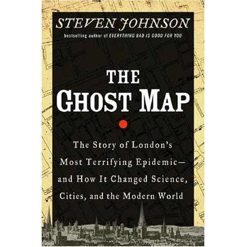
When Steven Johnson says his next book is going to be about cholera, you can't help but be a little surprised. Yet while it has very little to do with Johnson's recent books on video games, television and brain machines, The Ghost Map is much less a departure and much more of a welcom return to the territory of his first two books. Follow the paths set by Interface Culture and Emergence till the point where they converge and you will find The Ghost Map. It's easily Johnson's best work yet and perhaps the first classic urbanist text of the new century.
The setting is precise, a handful of blocks in London's Soho neighborhood, late summer 1854. The stakes however are impossibly large, with London at the lead, the world in 1854 is getting increasingly urban, and the more urban it gets the greater the threat of cholera becomes. Cholera's vector of transmission is the digestive tract. It comes into the body through drinking water, and exits the other end, taking with it an extraordinary amount of a person's internal fluids, and usually their life with it. This leaves the cholera bacteria with a rather nasty biological challenge, it's main point of reproduction is the small intestine, yet getting from one person's small intestine to another is quite a journey. For most of history this meant cholera played quite a minor character.
As the industrial revolution pushed more and more of the world into cities, a unique opportunity for cholera arrived. When hundreds of thousands, or even millions of people squeeze into the tight streets of a city, their shit tends to flow downhill, and often straight into the same river that their drinking water is pulled from. The city literally began to function as a shit eating, or more accurately drinking, machine and cholera epidemics began to pop up regularly. The result was often tens of thousands of deaths in short periods of time. If the urban form was going to continue to grow, and all the pressures of the industrial age were pushing in that direction, it would need to deal with the problem of cholera. In London, in Soho, late summer of 1854 in a remarkable series of events the city essentially learned how to deal with cholera and this is the story of The Ghost Map.
Johnson approach to history clearly owes a certain debt to Manuel DeLanda's A Thousand Years of Nonlinear History but this book is almost it's inverse, centering on a highly specific point in time and space, and following a potent narrative. Perhaps you can call it "A Thousand Hours of Linear History". Those compact hours that form the core of the book are in a way an intricate tracing of something straight out of DeLanda's work, the crossing of a material threshold which then allows humans to settle into entirely new urban formations. For only by conquering, or at least learning to manage, cholera can people and cities evolve towards the massive scales we see today. DeLanda however labors hard to produce almost entirely material histories, invoking odd concepts like robot historians and the viewpoint of minerals themselves. Johnson follows something of this form when he talks about bacteria and cities, but then interjects two intensely human actors into the picture to produce a radically different sort of book.
The most striking academic parallel to The Ghost Map is not DeLanda's work at all but Bruno Latour's The Pasteurization of France. It's been a long time time since I cracked upon that tome, and honestly I'm not certain I ever finished it, but Latour is telling a strikingly similar tale to Johnson, tracing the complex interplay of factors that lead Louis Pasteur to his ideas and the world into adopting him. Latour of course is almost deliberately obtuse in his explorations, his goal at the time was to multiply the possible explanations, so once again Johnson again takes a somewhat inverted approach. Johnson is of course one of the clearest and must lucid of the current crop of science and technology writers. Given Latour's recent exhalation of the art of writing as core to the successful application of his Actor Network Theory, one has to wonder if Johnson may have inadvertently produced one of ANTs finest documents.
Like Latour Johnson breaks from the hero model of scientific discovery. But while Latour and his ANT practicing colleagues attempt to introduce as many actors, both human and non-human, into the story as possible, Johnson finds a much more coherent middle ground. The traditional telling of this story focuses around John Snow the lone scientist fighting against prevailing opinion, and Johnson does not try to discredit him, but instead adds three more actors to the stage, the microscopic cholera bacterium, the massive water infrastructure of London itself, and the very human and very social figure of Reverend Henry Whitehead. The result is a complex yet compellingly clear tale of social, scientific, organic and urban forces interweaving to produce both a tragic outbreak of disease and ultimately it's solution. It may well be the best book on urbanism since City of Quartz, yet way more optimistic, and well worthy of a space next to Jacobs on your urbanism shelf.
September 29, 2006
Identity and Identification in a Networked World / Ian Kerr
Identity and Identification in a Networked World started today. It's a free conference held only minutes from my home so my attendance stems mainly from convenience mixed with mild interest in the subject. That means I walked in without any expectations and that's great cause I walked out pleasantly surprised despite a rather uneven selection of talks.
Ian Kerr keynoted on the topic of DRM and was quite enjoyable. It was pretty much Adam Greenfield's Everyware rewritten by a law professor. The QA was frustratingly short, but from his quick answer to my question I have a sense he's way too far into the technodetermanistic side of life for my taste in the end, but he managed to provoke and stimulate quite well. I believe in a degree of technodetermanism too, but what frustrates me about those who take a harder version of it, is that they never seem to be able to grasp the concept of cultural responses evolving over time in order to deal with a problem.
Good thing Kerr is a professor, for he was far more entertaining and thought provoking than convincing. His whole argument about DRM somehow veered entertainingly into the world of shopping carts, via the example of carts that lock their wheels as they leave supermarket property. But is that digital rights management? Somehow it seems a bit more like physical rights management to me...
September 15, 2006
It's Only Value Is That It Has No Value
All my bicycles are street bicycles, there are no dirt trails, half pipes or beautiful mountain passes in their future, only the torn urban asphalt of New York City. But there a whole variety of urban bicycles out there, and my latest frame finally emerged from six months of bike shop limbo with a working bottom bracket, which gives me three bikes, or one too many for an apartment dweller like me. The only question is which bike to get rid of, and it's proving to be a trickier problem than expected.
From a purely bike riding perspective its an easy question, the one I call my neighborhood cruiser has practically no value at all, it's worth more as parts than as a complete bicycle and those parts are not worth much.** It shouldn't be too hard to part with, should it? But that is exactly the problem. I live in New York City and this bike is actually tremendously valuable based on the sole fact that it has no value.
This is a bike I can lock up on the street and not stress about in the least. I can, and do even leave it out overnight. From an economic standpoint this creates quite an interesting situation, a value that can not be monetized, for the very act of this feature taking on a monetary value would eliminate any value that existed. A bike with a real monetary value is worth stealing and that translates directly into both financial risk and psychological stress for a bike owner.
From a purely urban perspective this is an easy problem as well, the nicest bike, with the nicest parts has the least use in the city. Sure it's nimble and quick, and the Phil Wood hubs are both buttery smooth and the most capable of handling the urban grit and grime over a lifetime that via sale or theft will probably be far longer than I will own them. It's both a little to valuable and little too sensitive to be an everyday, no matter the weather, vehicle. It's tight track geometry can zig and zag through every urban obstacle, but it also translates every bump and crack in the road back to the rider with far more precision than comfort. It is quite literally a physical manifestation of the phrase "too much information". As beautiful as thing is to ride it tells me a bit more about the state of the streets beneath me than my body wants to know. But as much as I love the city this is far to sweet a machine for me to just let go of and so it stays, it's visceral aesthetics trumping pure practicality.

Tactically the best maneuver would to take the middle machine, and somehow make it "street stable", somehow degrade it's value to a point it can be left locked up along overnight without much stress. It's perhaps an impossible task, how do you devalue a bicycle without eliminating just what makes it a good, fun thing to ride? This is a frame that's been evolving into what might be called an "inverse hybrid", a new style monster uniquely suited for urban riding.
The bicycle industry currently pumps out some hideous beasts it calls hybrids, essentially overgrown mountain bikes designed to be ridden fully upright. Basically they make it easier to ride over potholes while sucking the joy out of every other aspect of urban bike riding. The inverse hybrid is the reverse, fixed gear gives you control and real sense of the road, while chopped riser handlebars put you in the ultimate urban riding position. Higher than the drop bars of a road bike, but lower and narrower than the chunky riser bars of a mountain bike. It handles almost like an overgrown BMX, if a BMX was capable of any real speed and efficiency on the city streets. It's a stance that gives a unique combination of maneuverability, visibility, hopping ability and just the right feel of the road in your hands.
The challenge now is to make an inverse hybrid that no one wants to steal. So just how do you make something that's only value is that it has no real value?
** This is particularly true at this time of year, the beginning of the fall and the end of the bike season. Odds are for a few months in the spring this bike will be more valuable than the sum of it's parts, only to lose that property as days begin to get shorter.
September 10, 2006
Emergence 06: Closing Panel
Jeanette Blomberg is an anthropologist from IBM. So funny how easy it is to write a sentence like that now, as opposed to say 5 years ago...
Mark Jones is the service design lead at IDEO Chicago. He looks like Andy Dick.
Rick E. Robinson is smart, but I missed his particular credentials, beyond the Ph.D that shows up on his slides.
Jennie Winhall of RED.
Robinson:
"people live differently because of what a service allows them to do."
calls for a return to "longitudinal research" - focusing on continuity and change. big, expensive, expertise intensive.
Communispace has a 100% client renewal rate.
Noah takes a photo of himself everyday for 6 years.
Winhall:
"Service designers have no way of measuring costs of changes to design."
"Strong argument against over designing of services."
Emergence 06: Birgit Mager
Birgit Mager founded the first department of service design, at the Köln International School of Design and just now has founded the Sedes Research Center for Service Design Research. Her talk was quite good, a recapping of her work in Germany. At the same time it was a bit disappointing, Mager had been asking the sharpest questions repeatedly through the conference so I walked into the talk with expectations perhaps a bit too high. (But expectations always should be high!) Either way her work with the homeless in Köln is great.
random notes:
Gulliver: using service design to create a homeless center. "they found dignity there"
Emergence 06: Daniel Letts
<a title="Service Usability" Daniel Letts is a founder of Service Usability. Hist talk was a welcome dive into the nitty gritty of what actually gets produced by a service research organization. So nice to actually get a look at some of the deliverables.
random notes:
Services are not getting tested properly.
Web companies are rigourous testers though.
Apply the methodologies of online usability to the offline world.
SU Index, a one number score generated by there service usability audit.
September 09, 2006
Lunch Design/Conference Design

Actually breakfasts are always worse, but I forgot to photograph it. One thing conference designers never seem to think of is what food is best for creating a great environment. Lunch was a sandwich, which is mainly carbohydrates, with a bit of veggies and a modest amount of protein. There was also potato salad (more carbs), a banana (more carbs) and a cookie (more carbs). That's a formula for a food coma. The talk or two after lunch are never the most fun are they?
Breakfast as I said is worse. Pastries and muffins, all carbs, no protein, another recipe for putting people to sleep. In America this diet gets counterbalanced in part because people have plenty of energy after sleeping all night and in part because it's offset with large amounts of low quality caffeine. Downers cut with uppers, not exactly the path towards a healthy day, nor necessarily for the best conference experience. It works for the most part, minus that hour of post lunch coma, but can it be designed better?
Emergence 06: Oliver King
Oliver King is the founder of Engine a UK service design consultancy. His talk was pretty much a service design textbook as a powerpoint. He's also by far the most dynamic and charged of the speakers, perhaps he is the natural public spokesperson/sales person for the service design movement?
Random notes:
Started as a product designer, wanted to take it in a new direction, define the product brief, not follow the brief.
"Translation space", in between corporate strategy and implementation
Recommended Pine and Gilmore "The Experience Economy"
Making services U2D2: went by too quick for me to write down what this is.
5 Types of Projects
Discovering
Informing
Exciting
Optimizing
Specifying (most important from service design perspective)
Principal Methods of Service Design:
Systems Thinking
Service Blueprints
Design Research
Design Probes
Customer Personas
Communication
Authoring
Process Design
Facilitation
Visualization
Prototyping
Emergence 06: Stefan Holmlid
Stefan Holmlid has the most intriguingly titled talk: "Introducing White Space in Service Design: This Space Intentionally Left Blank". Conceptually it's also the most enticing idea presented so far. Unfortunately though there is perhaps too much white space in Holmlid's talk, a bit too much left unsaid to stimulate the mind to the full extent of the concept. Still the core question is key, what is the roll of white space, blank space, empty space, in the design of a service.
Emergence 06: Chris Downs
Chris Downs of livework :: service innovation & design talked about the evolution of his company as the first ever service design consultancy. A good talk, they do good work, not sure what I can add.
random notes:
"service envy"
"try and speak the language of business and not design"
"difference between systems design and service design"
"system is really efficient but the service really sucks"
"we design more products now as service designers then we did as product designers, but we design them from a service perspective"
Emergence 06: Jennie Winhall
I'm a pretty awful notetaker, I'd rather listen than write. The better the talk the less I write down. Jennie Winhall of RED gave an excellent talk on the work RED is doing in the UK with "Co-created services" in collaboration with various local government organizations. Plenty of info is up on their site.
RED currently is in the process of transitioning from an organization relying upon government funds into something... else. It will be interesting to see how that goes.
random notes:
"service that enables, rather and service that delivers"
"transformation design"
Emergence 06: Mary Jo Bitner
I'm out in Pittsburgh at Carnegie Mellon's Emergence 06 Conference, focused on Service Design.
The opening keynote is Mary Jo Bitner, Director for the Center for Services Leadership at Arizona State University.
The reason I'm here, and I suspect a healthy part of why this conference is being hosted by a design school, is due to a particular vision of services exemplified by the environmentally centered service vision exemplified by Interface Carpet and Paul Hawken. Bitner is a nice lead off as an explicit reminder that services are a far bigger, older and more staid world than the Hawken/Interface eco-revolution vision. She leads an institute firmly rooted in the business school and marketing world.
Coming from this space of academic business thinking, Bitner of course wants to talk about "innovation" in 2006. Unsurprisingly though nothing is particularly innovative about her talk and this is a good thing. Innovation is overrated and what Bitner has to offer is experience, a less exciting but far more valuable service. Service makes up as much as 80% of the economy in America, and according to Bitner yet service innovation lags significantly behind product innovation. It's probably true, but I have to wonder if that might have something to do with many services, hotels and restaurants for instance, have been evolving for thousands of years, while something like portable music players have at most a handful of decades behind them. The exact relationship between product innovation and service innovation was left unsaid. The airline industry can draw upon thousands of years of transportation services, yet at the same time many of it's core particulars are obviously dependent on airplane and airport technologies.
Bitner stresses that services are intangible (more on this later) and processes. She is also keen on pointing out that it's a very person driven industry, she quotes several CEOs talking about taking care of their employees, which somehow translates into taking care of the customers. The customers in Bitner's view are "in the factory", and studies apparently show that the more they get involved the more satisfied they are. Just how taking care of the employees translates into taking care of the customers is left unsaid and unproven.