
October 24, 2007
Photoshop by Committee
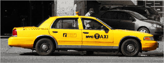
It's easy to just say design by committee. The story behind the new New York City Taxi graphics reads like a text book case. A firm makes a design. The client gives feedback. A new look comes in. Another firm comes late in the game with a new design element. A powerful department rejects a design for intruding on it's turf. The result is a sloppy hodgepodge of elements. Designers are rather predictably lining up to critique it.
Personally I rather like it. NYC Taxis have always had a sloppy mix of design elements on their side. Anything cleaner and neater, anything better designed, would threaten the only design element that matters. The bright yellow color screams "New York Taxi" louder than anything millions of design and innovation consulting fees could ever generate. As long as the cabs stay yellow, those taxis will look the same. What will never look the same again is NYC.
The new taxis provided a bit of political cover for an even bigger design project. New York City has a new logo. The suddenly infamous Wolff Olins designed it. and the new NYC taxis are the first place most New Yorkers have been exposed to it. Those taxis are design by committee, but that logo is something different. You can call it Photoshop by committee. Get used to it cause you'll be seeing a whole lot more of it.
What happens when you have a committee where every single member has a copy of Photoshop on their computer? Or worse yet every member has a designer on staff? Design by committee once broke down to a bunch of opinions and needs, all sorted out by one or two designers. The committee stacked up its requirements, its problems and its bullshit, and the designer cooked it all up into some bland result. A designer in that situation today would feel blessed.
What happens in Photoshop by committee is far worse. The needs and the problems and the bullshit are still there of course. But then comes the designs. Not just from the designer, but from the committee members. From their staff designers. From their assistants. From their teenagers and toddlers. From their neighbors, coffee shop baristas and dogs. Committees were once additive, the members just piled on the guidelines and suggestions and the designer boiled them down into a result. Now committees are recombinant. They warp, splinter and evolve into competing designs. The designer is barely the designer at all. They are the person who must make these mutations all work together.
Design by committee is about making rules. Photoshop by committee is about breaking rules. It's often the only way the designer can get the multiplying designs to recombine. Wolff Olins' professional salespeople call this "container logos" and it seems to be winning them some super premium clients. Most of us would just call it bullshit, but we aren't the ones with the super premium clients.
In the case of New York City what this amounts to is a big old smudge of the letters NYC. Not surprisingly it looks a lot like design from the early days of Photoshop. A design from an era where designers had no idea how to use the powertools in their hands. It's ugly and clunky and has nothing to do with NYC beyond using the letters. I love it. It follows none of the rules of design that stifle the profession. It's loud and bold and will show up in all sorts of places. Like the full NYC taxi design it graces, it will never step out of the shadows of a far bolder design, Milton Glaser's classic I (heart) NY logo. Is it great graphic design? Not at all. But it is great Photoshop by committee and it will work just fine.
Posted by Abe at October 24, 2007 09:57 AM