February 19, 2007
Symbolic Action (In Defense of the New Radiation "Symbol")

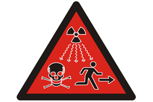
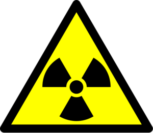
Well next time you see that sign a coming you better run. It's a new supplemental symbol for radiation danger, commissioned by the International Atomic Energy Agency (IAEA) and the International Organization for Standardization (ISO) and designed to convey danger in a more intuitive way then the traditional radiation "trefoil". Now the interaction designers over at Adaptive Path are absolutely turding all over the results (and Michael Beriut just sighs), and in many ways they are right, it clearly is the result of design by committee and there is nothing elegant nor simple about symbol they generated.
Then again, there is nothing simple nor elegant about dying from radiation poisoning is there? And to ask the IAEA and ISO to do anything but design by committee is akin to something in between asking for a complete redesign of international relations and the impossible. To accuse them of design by committee is a completely valid statement of fact, but it's also a rather impotent critique. To ask them not to design by committee may be fantasy, but we can very reasonably ask and expect them to design by committee the right way (or at least in one of the right ways) and with the new radiation symbol that appears to be be exactly what we got.
Now I have a lot of respect for Adaptive Path and I'm sure with the appropriate time and resources they could produce a symbol at least as good and most likely better than what has been created. In that process one of the first things they'd probably learn is something that is clearly not evident their current critique, that it is radically more difficult to create symbols that invoke action then it is to create symbols that describe objects.* At least at this juncture in time signage symbols are inherently static, solid and rigid. To transform a static, solid or rigid object into a symbol, is a relatively straight forward act of abstracting the objects characteristics into lines shapes and colors. Some objects are easier to work with than others, but all at least possess tangible starting points to abstract from. Verbs however are by there very nature intangible, and more difficult to capture in abstraction. When the goal is not just to encapsulate the verb, but actually trigger it, to create sign that does not just represent but actually creates an action then the challenge is exponentially harder, and that is exactly the challenge the IAEA and ISO were faced with, creating a sign that does not just warn people, but actually causes them to turn and run for their fucking lives. Not exactly the easiest task.
There is one sign that is radically more effective at creating action than any other, and that is the stop sign. Part of it's effectiveness is it's ubiquity, it many cultures you can find the stop sign just about everywhere, so it's easy for the meaning to get ingrained. The red color helps as well, but ultimately the stop sign is successful because all symbols are stop signs. Often it's more of a mental stop then the physical stop, but one can not process a symbol unless one pauses for microsecond and then reads it. When one reads the stop sign one has already begone the process of stopping, all the sign does is say continue on through with the stopping process. No matter how fast one might be traveling as soon as one actually sees the stop sign there is at least a little bit of inertia going into the act of stopping.
What this means in terms of making signs like the radiation symbol designed to induce action, is that task is even more difficult. Conveying an action in static is hard enough, and getting people to follow through and actually do the action it is exponentially harder, but on top of that the very fact that the message is embedded a symbol is invoking the exact opposite effect, causing the reader to pause and stop for at least a second before hopefully doing a 180° turn and running away. And it's this challenge that the committees of the IAEA and ISO were faced with as they went about designing their new symbol.
The result is indeed neither very elegant nor simple, but it is in fact I think rather effective and quite interesting.** Rather then produce a symbol as they claimed to have done, they actually produced something rather different, a small comic, five symbols sequenced to invoke an action. It's actually a rather innovative solution, something which contrary to the Adaptive Path post, you actually would not really expect to emerge from a committee in action. For if the goal is to create an action, a static symbol is not the right way to do it. But by creating a microcomic, a sequence of symbols, what emerges is not just a static sign, but a sign filled with action, filled with invisible gaps between the actual symbols, gaps that the mind fills in with actions. Gaps that turn the static noun of a flat still piece of signage into an active verb, a true call to action. It might not be the best looking sign but it pretty clearly warns far better than then old abstraction of the "trefoil." So there you have it, read the signage on the wall and get the fuck out of here ; )

- This lack of distinction is clearly apparent in the hypothetical symbol for taxi that is used as a rhetorical device in the Adaptive Path blog post. A taxi is of course an object, a noun, while running from radiation is an action, a verb, yet in the post they imagine that the taxi symbol would be created in a similar manner as the run from radiation symbol.
** It is however certainly not perfect, I'm a bit concerned with how people accustomed to reading right to left would interpret the bottom, it could well mean "if you run you die". However the symbol was apparently tested in China, Saudi Arabia and Morocco, so at least due diligence seems to have been done in that regard.
February 14, 2007
Political Targets
Reading Googlection 2008 makes it look like the Republicans are way ahead on using search engine advertising to push their candidacies for the US president. It's not super surprising knowing that Karl Rove comes from a direct marketing background and the GOP has historically been better at micro-targeting voters. It is ironic though that for all the Democrats diversity rhetoric, they still market themselves to the masses, while the Republicans push a monoculture world view and then push their candidates to diverse niches...
